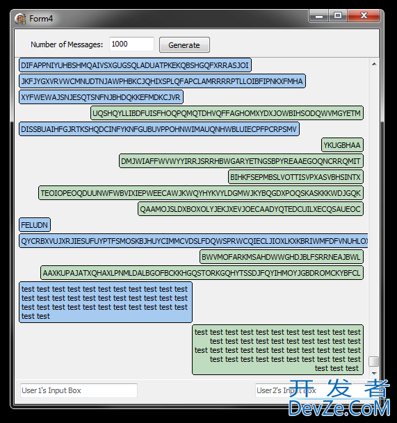
Does anyone know how to make labels, or text, smoother? At the moment they look quite jagged. As I want to 开发者_如何学Pythonmake the label dynamic, I can't just insert the text from Photoshop.
You'll have to dynamically generate images representing your text if you want to anti-alias it. Here is an example on msdn: http://msdn.microsoft.com/en-us/library/a619zh6z.aspx
EDIT: Editing per comment below.
The link describes using the OnPaint event of your control to use a different TextRenderingHint. If you're wanting something a little more re-useable what you can do is create a Custom Label class that extends the Label class, and use this in your forms:
public partial class CustomLabel : Label
{
    private TextRenderingHint _hint = TextRenderingHint.SystemDefault;
    public TextRenderingHint TextRenderingHint
    {
        get { return this._hint; }
        set { this._hint = value; }
    }

    protected override void OnPaint(PaintEventArgs pe)
    {
        pe.Graphics.TextRenderingHint = TextRenderingHint;
        base.OnPaint(pe);
    }
}
Add a new Custom Control called CustomLabel (or whatever you want to call it) and use the code above. Rebuild your project and you should then see the CustomLabel control appear in your toolbox at the top, under the "MyProject Components" category. In the properties pane for this custom label you'll see the new TextRenderingHint property. Set this to "AntiAlias." Add another label to your form and compare how they look.
If you want to default it to AntiAlias simply change the default value of the private variable.
Are you referring to ClearType? Then ClearType has to be enabled in Windows, and you must use a modern font, such as Tahoma or Segoe UI, not MS Sans Serif.
Update
You posted an example of the problem. I magnified it to 400 %. Clearly ClearType subpixel antialiasing is enabled. Personally I do not think the text looks jagged. If you want higer quality on-screen text you could buy a screen with a higher physical resolution (pixels per inch), and then draw the text at a (correspondingly) larger size. Then the text will have the same size on your screen, but will look much more smooth.
You could also give up on ClearType and use some other font-smoothing algorithm, but that is far from trivial, because ClearType is the font-smoothing system on Windows.
Update 2
If you are running Windows 7, you can fine-tune ClearType. Just open the start menu, write "ClearType" and start the guide. I think there are guides for Vista and XP too, but perhaps not installed by default, but available as PowerToys or something like that...
Make sure you have ClearType enabled.
Install MacType program, it smoothes your Windows font like MacOS, I don't know why Microsoft don't fix its Windows smoothness font? If Microsoft fixed its fonts, I don't need to install third party app to such things like that which is fundamental for Windows.


![Interactive visualization of a graph in python [closed]](https://www.devze.com/res/2023/04-10/09/92d32fe8c0d22fb96bd6f6e8b7d1f457.gif)
 加载中,请稍侯......
精彩评论