I'm trying to draw vertical text in win32 GDI api. I call CreateFont() with 2700 for the angle and 900 for bold.
logPxlY = ::GetDeviceCaps (c->_hdc, LOGPIXELSY);
_hfont = ::CreateFont (-::MulDiv (point, logPxlY, 72),
    0, angle, weight, 0, FALSE, FALSE, FALSE, 0, 0, 0, 0,
    FIXED_PITCH | FF_MODERN, face);
where face is "Courier New", point is 9, angle is 2700 and weight is 900.
The text IS rotated correctly, but it's pretty dang faint compared to normal Courier New rendering. Is this since truetype is polishing the normal text real开发者_JAVA百科 nice and isn't bothering with wierd rotated text or something?
Thanks for any insight :)
The font mapper can be a bit strange at times. 700 is bold, 900 is supposed to be "black". However, you probably have a Courier New Bold font file, so it can be used directly, whereas you probably do not have a Courier New Black font file, so it'll be synthesized -- probably from the normal Courier New font instead of from Courier New Bold (not sure why that is, but such is life).
If you try running through the possibilities, something like this (MFC code, for the moment, but the idea applies regardless):
CFont fonts[num];

pDC->SetBkMode(TRANSPARENT);
for (int i=0; i<num; i++) {
    fonts[i].CreateFont(10, 0, 2700, 0, i*100, 0, 0, 0, DEFAULT_CHARSET, OUT_CHARACTER_PRECIS, OUT_CHARACTER_PRECIS, PROOF_QUALITY, FF_MODERN, L"Courier New");
    pDC->SelectObject(fonts+i);
    pDC->TextOut(20+i*14, 20, L"This is some text");
}
What you'll probably see (what I get anyway) looks like this:
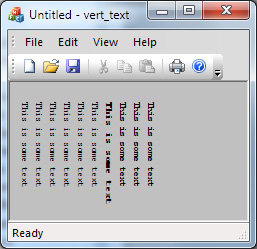
The 700 weight font is noticeably bolder than the 800 or 900 weight. This is not unique to Courier New either -- for example, the same code with the font name changed to Times New Roman produces output like this:
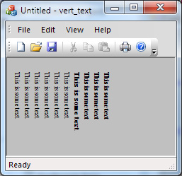
That's a bit closer, but the 700 weight still clearly looks darker than the 800 or 900. I won't bore you with screen shots, but the same effect happens when the text is horizontal.
Edit: One other minor detail: though it probably doesn't make any difference, you're currently computing the size of the font a bit incorrectly -- you're using logpixelsy, which makes sense when the font is horizontal. For a vertical font, you should use logpixelsx instead. On a typical screen, those will be identical, but on a printer (for example) they may be substantially different.


![Interactive visualization of a graph in python [closed]](https://www.devze.com/res/2023/04-10/09/92d32fe8c0d22fb96bd6f6e8b7d1f457.gif)

 加载中,请稍侯......
精彩评论