I want to display three buttons in the middle of a screen, and have the three buttons all be the same width, though they will have text labels of different lengths.
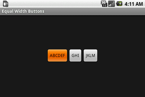
Just adding three buttons with text labels of different lengths produces buttons of different widths.
<?xml v开发者_如何学编程ersion="1.0" encoding="utf-8"?>
<LinearLayout
    xmlns:android="http://schemas.android.com/apk/res/android"
    android:orientation="horizontal"
    android:layout_width="fill_parent"
    android:layout_height="wrap_content"
    android:layout_gravity="center_vertical"
    android:gravity="center">
    <Button
        android:id="@+id/button_1"
        android:layout_height="fill_parent"
        android:layout_width="wrap_content"
        android:text="ABCDEF" />
    <Button
        android:id="@+id/button_2"
        android:layout_height="fill_parent"
        android:layout_width="wrap_content"
        android:text="GHI" />
    <Button
        android:id="@+id/button_3"
        android:layout_height="fill_parent"
        android:layout_width="wrap_content"
        android:text="JKLM" />
</LinearLayout>
default button width wraps contents:

--
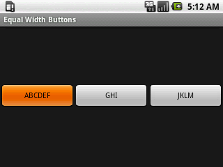
Setting the layout_weight to 1 and the layout_width to 0dip on all the buttons causes them to stretch equally to fill the entire screen width. For what I want, such buttons are simply too big, especially on large screens.
<?xml version="1.0" encoding="utf-8"?>
<LinearLayout
    xmlns:android="http://schemas.android.com/apk/res/android"
    android:orientation="horizontal"
    android:layout_width="fill_parent"
    android:layout_height="wrap_content"
    android:layout_gravity="center_vertical"
    android:gravity="center">
    <Button
        android:id="@+id/button_1"
        android:layout_height="fill_parent"
        android:layout_width="0dip"
        android:layout_weight="1"
        android:text="ABCDEF" />
    <Button
        android:id="@+id/button_2"
        android:layout_height="fill_parent"
        android:layout_width="0dip"
        android:layout_weight="1"
        android:text="GHI" />
    <Button
        android:id="@+id/button_3"
        android:layout_height="fill_parent"
        android:layout_width="0dip"
        android:layout_weight="1"
        android:text="JKLM" />
</LinearLayout>
layout weight 1 buttons fill screen width:

--
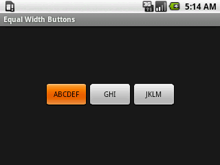
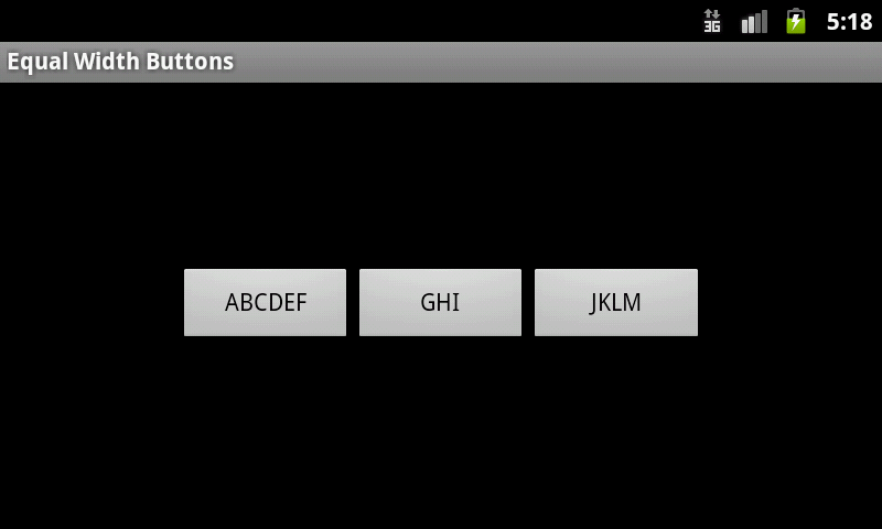
Setting different values for weightSum in the parent LinearLayout can be used to stop the buttons from filling the entire screen, but I don't think this is the path I want to take, because I don't want the buttons to occupy a large portion of the screen on large screen devices. To clarify, using weightSum, I could, for example, set the three buttons to collectively occupy half the screen width, which may look OK on small screens, but on a large screen, the buttons would still occupy half the screen width, and the buttons would simply be much larger than what I want. Perhaps the final solution will be to simply have different layout files for different screens, but I'd rather not go down this path.
<?xml version="1.0" encoding="utf-8"?>
<LinearLayout
    xmlns:android="http://schemas.android.com/apk/res/android"
    android:orientation="horizontal"
    android:layout_width="fill_parent"
    android:layout_height="wrap_content"
    android:layout_gravity="center_vertical"
    android:gravity="center"
    android:weightSum="5">
    <Button
        android:id="@+id/button_1"
        android:layout_height="fill_parent"
        android:layout_width="0dip"
        android:layout_weight="1"
        android:text="ABCDEF" />
    <Button
        android:id="@+id/button_2"
        android:layout_height="fill_parent"
        android:layout_width="0dip"
        android:layout_weight="1"
        android:text="GHI" />
    <Button
        android:id="@+id/button_3"
        android:layout_height="fill_parent"
        android:layout_width="0dip"
        android:layout_weight="1"
        android:text="JKLM" />
</LinearLayout>
weight sum 5 small screen:

weight sum 5 large screen:

--
I also tried many things with TableLayout, but didn't get anything better than just using LinearLayout.
GridView is extra-clumsy to use, and I haven't tried it, yet.
So, how does one create buttons with equal widths, preferrably where they are only as wide as necessary to fit the contents of the button with the longest label?
Any advice is appreciated.
(I did search and find this question asked and answered many times, but none of the answers I found resolved what I'm trying to achieve.)
Perhaps the final solution will be to simply have different layout files for different screens, but I'd rather not go down this path.
Many programmers will use res/layout/ and res/layout-large/ for handling situations like this. In the limited case of the three buttons, you might have alternatives, but usually user interfaces aren't quite that simplistic.
So, how does one create buttons with equal widths, preferrably where they are only as wide as necessary to fit the contents of the button with the longest label?
To accomplish your "preferrably" [sic] requirement, you would need to create a custom layout class for that. Here is one related to it, for the dashboard pattern, that you might use as a starting point.
If you know in advance what your widest button text will be you can use the android:ems attribute to set your buttons to that width.
<Button
    android:id="@+id/my_button"
    android:layout_width="wrap_content"
    android:layout_height="wrap_content"
    android:minEms="5"
    android:text="@string/my_button" />
It's not perfect but it's the easiest way that I've found to achieve this look without endlessly fiddling around with layouts.
use Dashboard Fragment class
http://code.google.com/p/iosched/source/browse/android/src/com/google/android/apps/iosched/ui/DashboardFragment.java
Just one additional note from my side!
If you will need to set the width (or height) for the buttons (or any other views with a simple changes of code) that are added at runtime, you can use the code below (it does not depend on orientation):
public void AlignButtons(){
    llModules = (LinearLayout) findViewById(R.id.llModules);

    ViewTreeObserver viewTree = llModules.getViewTreeObserver();
    viewTree.addOnPreDrawListener(new ViewTreeObserver.OnPreDrawListener() {
        public boolean onPreDraw() {

            int childcount = llModules.getChildCount();
            int maxWidth = 0; //int maxHeight = 0;

            String fontPath = "fonts/Isabella-Decor.ttf";
            Typeface tf = Typeface.createFromAsset(getAssets(), fontPath);

            for (int i = 0; i < childcount; i++) {
                LinearLayout v = (LinearLayout)llModules.getChildAt(i);
                View vv = v.getChildAt(0);
                if (vv instanceof Button) {
                    int width = vv.getMeasuredWidth();
                    maxWidth = (maxWidth > width) ? maxWidth : width;
                    //int height = vv.getMeasuredHeight();
                    //maxHeight = (maxHeight > height) ? maxHeight : height;
                }
            }
            for (int i = 0; i < childcount; i++) {
                LinearLayout v = (LinearLayout)llModules.getChildAt(i);
                View vv = v.getChildAt(0);
                if (vv instanceof Button) {
                    LayoutParams params = ((Button) vv).getLayoutParams();
                    params.width = maxWidth;
                    //params.height = maxHeight;
                    ((Button) vv).setLayoutParams(params);

                    // Applying font
                    ((Button) vv).setTypeface(tf);
                }
                vv = v.getChildAt(1);
                if (vv instanceof TextView) {
                    // Applying font
                    ((TextView) vv).setTypeface(tf);
                }
            }

            return true;
        }
    });
}
Here, in my case:
llModule - some layout containing another layout with what we need to align(v.getChildAt(0);) and other(v.getChildAt(1);).
LinearLayout v = (LinearLayout)llModules.getChildAt(i); - obtain layout of buttons to align.
Other parts are clear to understand.
Two cycles in this code are quite identical, but I still can't imagine how to combine them (to speed up the execution time).
Use this proper code this will help you.
<LinearLayout
    xmlns:android="http://schemas.android.com/apk/res/android"
    android:orientation="horizontal"
    android:layout_width="fill_parent"
    android:layout_height="wrap_content"
    android:gravity="center"
    android:weightSum="3">

<Button
    android:id="@+id/button1"
    android:layout_width="0dp"
    android:layout_weight="1"
    android:layout_height="wrap_content"
    android:text="Get the Time"
    android:onClick="showNewDate" />
<Button
    android:id="@+id/button2"
    android:layout_width="0dp"
    android:layout_weight="1"
    android:layout_height="wrap_content"
    android:text="Get the Time"
    android:onClick="showNewDate" />
<Button
    android:id="@+id/button3"
    android:layout_width="0dp"
    android:layout_weight="1"
    android:layout_height="wrap_content"
    android:text="Get the Time"
    android:onClick="showNewDate" />
Keep the individual buttons under its own RelativeLayout.
<LinearLayout
    android:layout_width="match_parent"
    android:layout_height="wrap_content"
    android:orientation="horizontal">

    <RelativeLayout
        android:layout_width="wrap_content"
        android:layout_height="match_parent"
        android:layout_weight="1">

        <Button
            android:layout_width="match_parent"
            android:layout_height="wrap_content"
            android:layout_alignParentStart="true"
            android:text="Button1"/>
    </RelativeLayout>

    <RelativeLayout
        android:layout_width="wrap_content"
        android:layout_height="match_parent"
        android:layout_weight="1">

        <Button
            android:layout_width="match_parent"
            android:layout_height="wrap_content"
            android:layout_alignParentEnd="true"
            android:text="Button2"/>
    </RelativeLayout>
</LinearLayout>
Reading this thread, then doing some trial-and-error and noticed that android:layout_width="180px" is an accepted parameter. Now as said, I just stumbled on this, didn't try to use this to solve your three button scenario.
It could well be that things changed since you originally posted. Although I tried this while building for version 1.5. That's old enough... :-)
Here is the complete main.xml:
<?xml version="1.0" encoding="utf-8"?>
<LinearLayout
    xmlns:android="http://schemas.android.com/apk/res/android"
    android:orientation="vertical"
    android:layout_width="fill_parent"
    android:layout_height="fill_parent">

    <TextView
        android:id="@+id/dateText"
        android:text="\n\nClick for Date\n\n"
        android:layout_width="wrap_content"
        android:layout_height="wrap_content" />

    <Button
        android:id="@+id/button"
        android:layout_width="180px"
        android:layout_height="wrap_content"
        android:layout_gravity="center_horizontal"
        android:text="Get the Time"
        android:onClick="showNewDate" />

</LinearLayout>


![Interactive visualization of a graph in python [closed]](https://www.devze.com/res/2023/04-10/09/92d32fe8c0d22fb96bd6f6e8b7d1f457.gif)


 加载中,请稍侯......
精彩评论